Back

Kuchnia Otwarta restaurant

Kuchnia Otwarta restaurant
Designing a logo and identification for a restaurant in Katowice

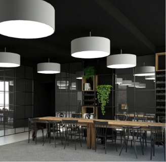
A unique Katowice restaurant with a view of the guest kitchen.

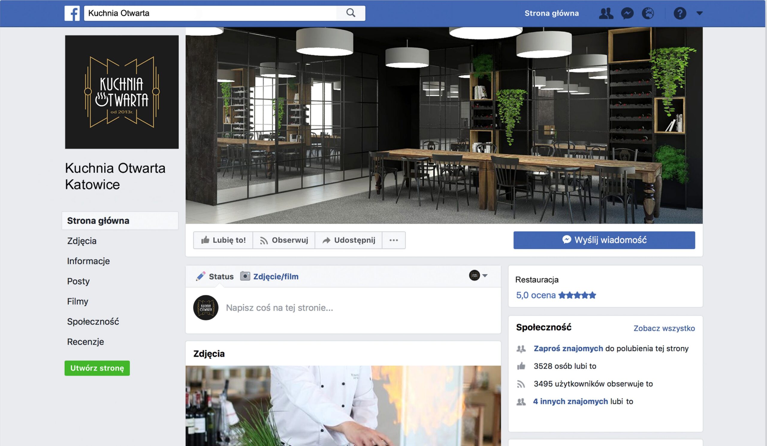
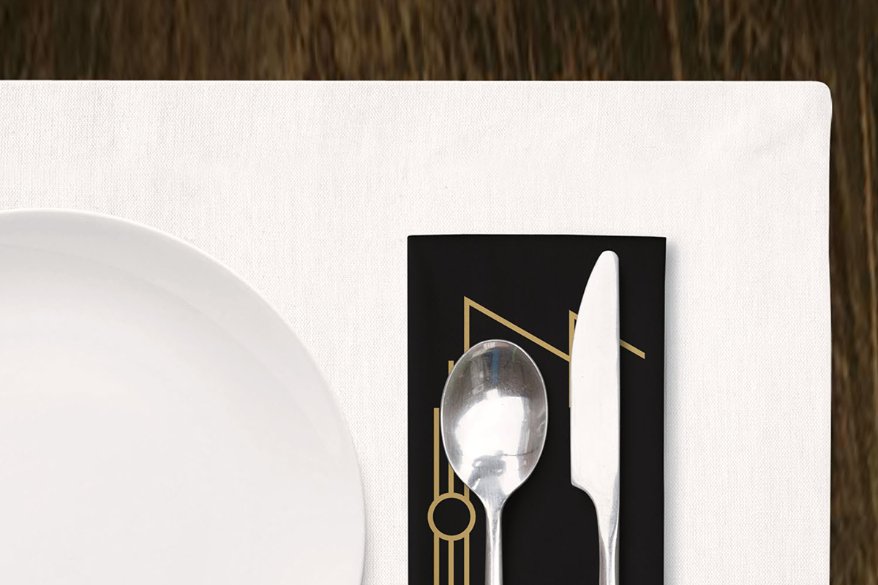
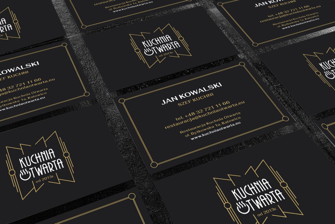
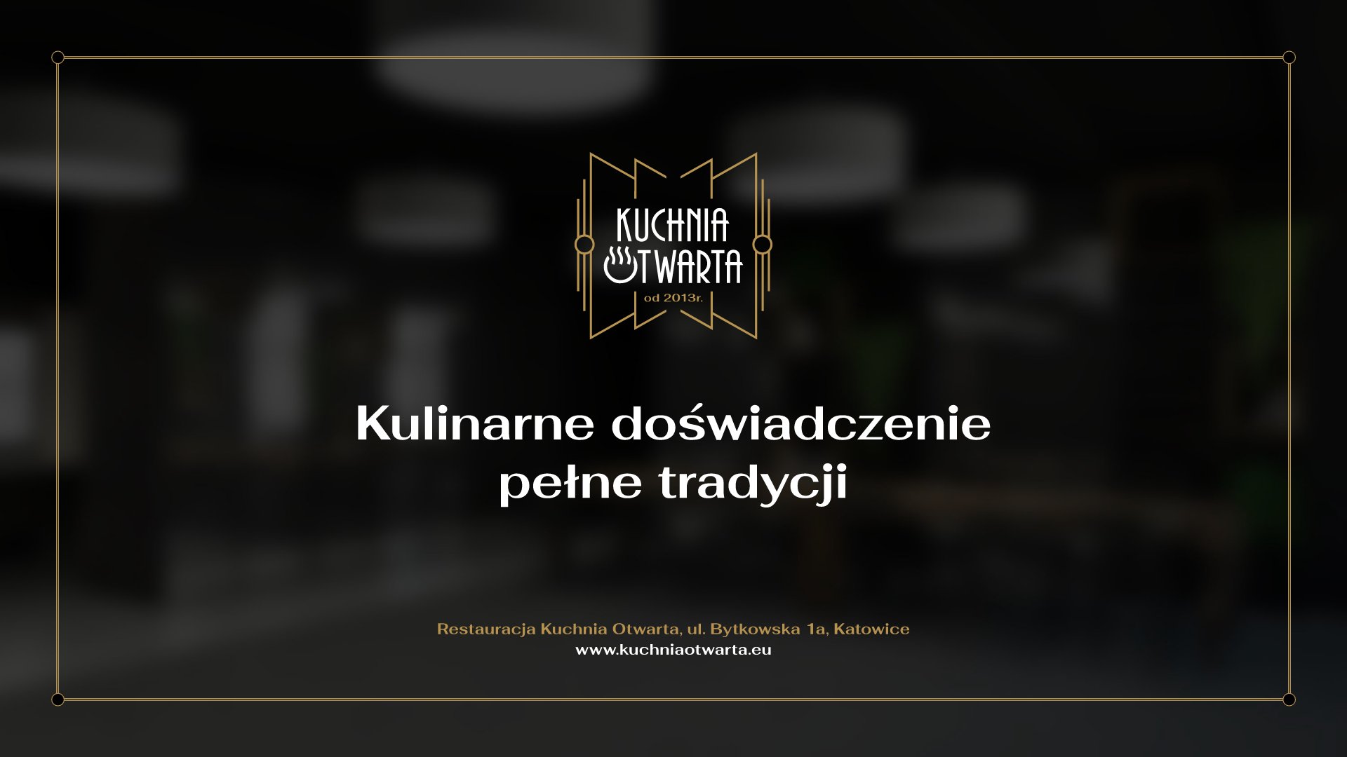
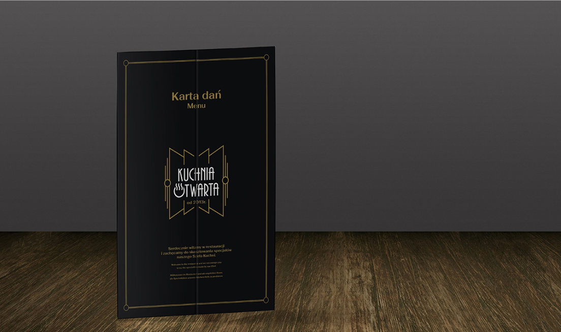
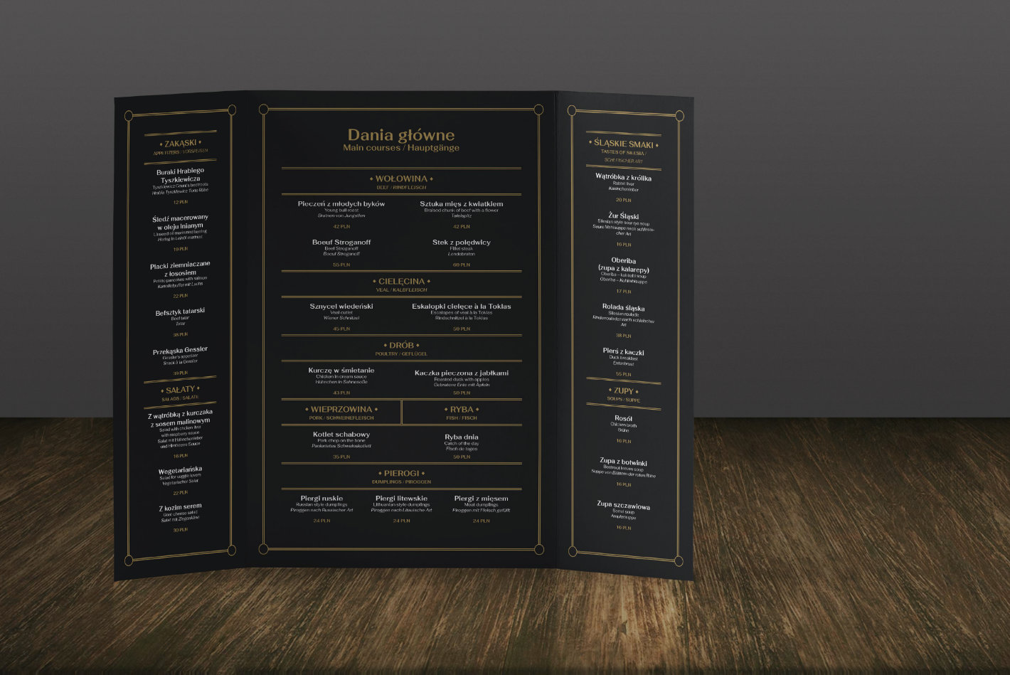
We have developed the concept of a new logo and the basic elements of the restaurant’s image. The aim of these activities was to create a coherent image of the restaurant, combining modernity and tradition, and then presenting these qualities in a visual form. It was important to emphasise the characteristics that distinguish the restaurant from its competition (open kitchen, French service). The materials that we create are to serve the brand of the restaurant and represent it for many years. The concept has not been fully implemented.

The concept has not been implemented.

Target image

Assumptions about brand attributes

Openness

interwar kitchen

tradition

modern twist

elegance

smell

art deco
Typografia Symbolika Stylistyka Znak graficzny został oparty na kształtach, które nawiązują do szeroko otwartych drzwi, co jest oczywiście bezpośrednim nawiązaniem do otwartości kuchni, czyli największego wyróżnika restauracji. Forma ta w naturalny sposób podkreśla samą nazwę restauracji. Element ten może jednocześnie przywodzić na myśl kształt muszki, które docelowo mają nosić kelnerzy, co dodatkowo u spójnia wizerunek. Zgodnie wytycznymi znak oparto na stylistyce Art Deco, która klowała w okresie między wojennym. Styl ten jest bardzo charakterystyczny, co ułatwi odbiorcom zidentyfikowanie restuaracji z kuchnią międzywojenną, Symbolika którą oferuje. Dopasowany kj pisma nawiązujązuje do wspomnianego stylu Art Deco i idealnie pasuje do przekazanej wcześniej koncepcji odświeżonego charakteru restauracji. Dodatkowy element graficzny wpisany w literę “O wzbogaca znak o nawiązanie do talerza i unąszącego się nad nim aromatu potrawy, dzieki czemu komunikat wizualny jest dopełniony. Dzięki skontrastowaniu kolorem nazwy i elementów graicznych logo znak zyskuje na czytelności.

Symbols

The graphic sign was based on shapes that refer to a wide-open door, which is obviously a direct reference to the openness of the kitchen – the restaurant’s distinguishing feature. The form naturally emphasises the name of the restaurant.ally makes the image coherent.

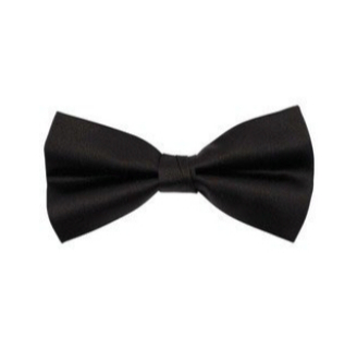
At the same time it brings to mind the shape of a bow tie that the waiters are to wear, which addition

Stylistics

In accordance with the guidelines, the graphic sign was based on the Art Deco style that reigned in the interwar period. The style is very characteristic, which will enable the recipients to identify a restaurant with interwar cuisine and the symbolism it offers.

Typography

The tailored writing form refers to the Art Deco style aforementioned and perfectly matches the previously described refreshed concept of the restaurant.

An additional graphic element inscribed in the letter “O” enriches the sign with a reference to the plate and the aroma of the dish floating above it, thanks to which the visual message is complete.

Thanks to contrasting the color of the name and the graphic elements, the logo gains legibility.